
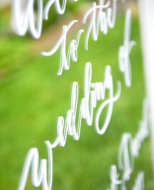
Tips for Styling Calligraphy on Instagram
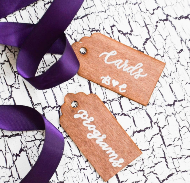
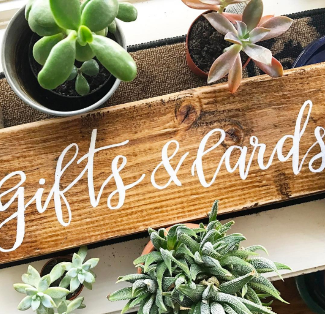
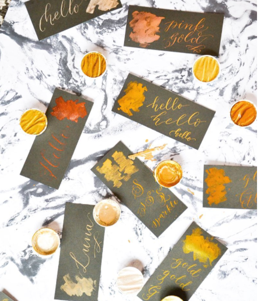
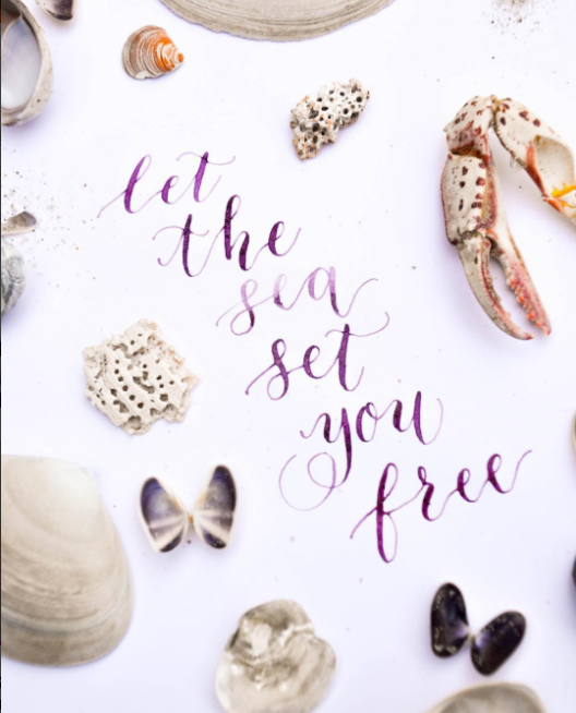
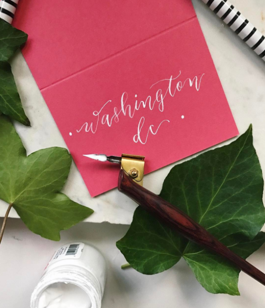
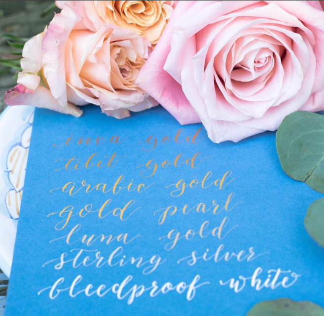
Texture is everything
Add ribbons, coarse or fine fabrics, or even layer up more paper! I like to do this to make the shot a little more interesting. Sometimes I will use patterned paper to serve as a backdrop, or I will simply use a textured fabric. Personally, I gravitate more toward neutrals and I like to let the medium speak for itself. If I am posting a photo of a wooden slab, I really want the grain of the wood to stand out, not be overwhelmed by a showy backdrop.
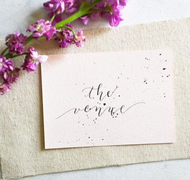
A pop of color never hurts
Even in a monochromatic setup, I find that a good flat lay always has an interesting burst of color. Whether it be your ink or the actual medium you're using, or even your own supplies, a colorful interruption livens up your feed and attracts other eyes. Nibs, watercolor palettes, and even flecks of paint add as a point of interest!
planning ahead
I like to use the app Planoly to see what my post will look like in conjunction with my feed ahead of time. Without purchasing any premium options, Planoly lets you drag and drop "future" photos that you're considering using. If you're a little OCD like me, this might be the app for you! Sometimes, I just don't like how a certain photo stacks up to another - call me crazy.
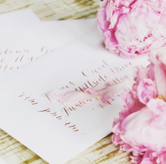
You can never go wrong with florals
...or any other object that fits your motif! Florals pack a punch, not only because they offer some color (see tip no. 2), but they also add beauty and a sense of serenity to your work. I love dropping rose petals, or even plopping down a section of a bouquet, right down next to my subject as I prepare to take a photo.
Do you have any pro-tips? I'd love to connect!!