
The Thoughts Behind My Rebranding
I was more than halfway through the rebranding process of my website when it dawned on me: my blog is turning ten years old this year! It couldn’t be a more timely undertaking. The idea of a brand refresh started sometime in summer ‘24, when I was pregnant with my second and already retreating from some creative projects I wanted to say “yes” to, but had to wait. When it finally came time for the opportunity to rebrand, I thought it was perfectly timed without realizing that it was also time to celebrate 10 years of my creative website.
Working with friends at LA Concepts, we kicked off the process in late November (finally) and worked throughout the winter to define my brand identity as a photographer, creative, and blogger. Hunkering at home with my newborn, we worked over video calls and brainstormed more than I ever thought was necessary. I wrote all about the process here, extensively, and how surprisingly difficult it was.
Logo, Colors and Brand Elements


The fun stuff, especially the website, and the visual assets, really became my source of joy over the last few months. The new A. Taylor Studio website is a little moodier, with an intentional color scheme and making difficult decisions to let go of some of my old favorite looks. For example: my new logo replaced a hand-drawn calligraphy lettering that had a very symbolic yin-yang thing going on. With the new logo, I like the intentional connectedness of my first two initials (A/T) instead of the prior division of the letters. There is a ton of thought and intention behind the new logo.
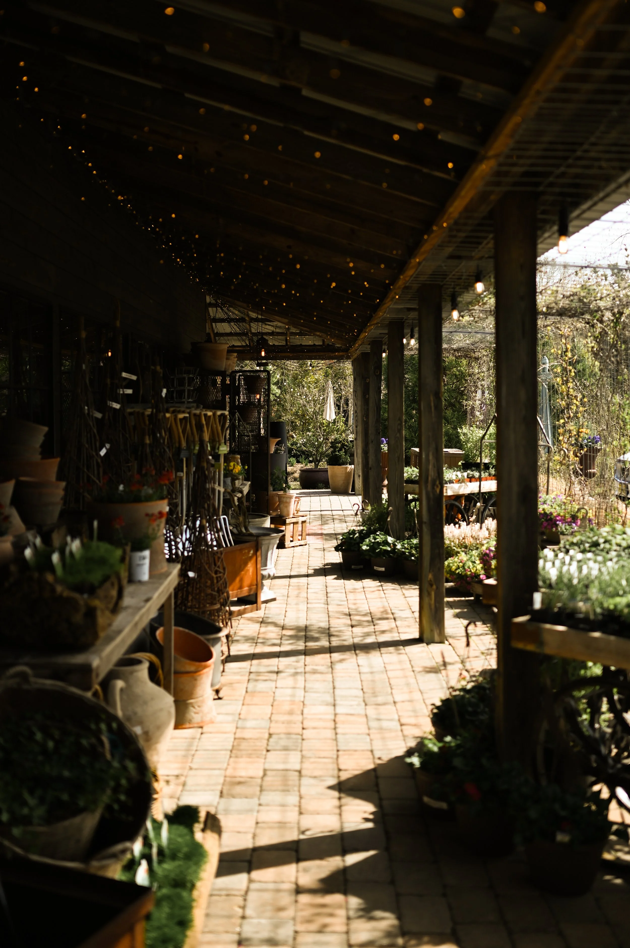
One of our brand goals was to establish a sense of geography of where I am in the world. The blog colors, including rich umbers and silvery sage, are a nod to the colors of the brownstones and earthy fields of Bucks County, PA where I call home. The colors also reflect some of my most recent photographic mood, with a lot of my work playing off underexposed shots that give off a natural, yet darker feel.
colors as inspiration
underexposed shots playing with light has become a signature look in my photos
In another acknowledgment of my surroundings, we included the state flower of Pennsylvania, mountain laurel, in some of the visual assets. I toyed with the idea of sketching my own to bring my own hand back into the mix, but…time becomes a little less available as a new-again parent.
Brand Identity
My new tagline came from off-the-cuff conversation during the branding process. A. Taylor Studio is very much a seasonal blog, where I post (in real time - not scheduled out months in advance) about how I am navigating life as it is right now. Visually, it’s also my home for all of my photography — sort of a creative hub — and I often look back to old posts as archives of my favorite photos.
A seasonal lifestyle blog rooted in a love for imagery.
At its core, this blog is a celebration of photography — life’s little joys captured in images.. It’s a little bit curated and aspirational, but photography is the common denominator. For 10 years I've blogged about everything from fashion to recipes to travel to motherhood and even very specific things. But in its entirety, this blog is too broad to be niched as anything other than “lifestyle.” At one point I said that what I do is “rooted" in a love for imagery — a love for beauty — and we all kind of knew that verbiage had to stick around somehow. I love how the term “rooted” harkens to my love for botanicals, which is an area of focus as I work with creative brands and professionals who work with plants and celebrate outdoor spaces.
Social Media
My social media presence is two-fold: @ataylor.creative for my photography portfolio, and @ataylor.studio is for ancillary lifestyle content that serves as a natural extension from this blog. The content you see there has metamorphosed to align more with the blog’s values, which is really important to me.
Concluding Thoughts
The rebrand process was deeply personal and I am so grateful that I got to work with LA Concepts to hear their takes and branding expertise. They were so patient during every little bout of indecision, which was frequent and prolonged. I learned so much through the branding process, and definitely have a newfound appreciation for just how tough it is. One thing that I already knew, however, was just how deeply I value this blog and website. I’ve poured a lot into it and I’m so happy that there is a little more cohesiveness among the website, my social media pages, and my photography. It’s so important in the creative process to get it right the first time, and I am so glad we didn’t rush the process. I’ll be spending a lot of time here, on good old desktop view…but honestly, you being here means the world to me and makes this whole endeavor worth it.
ciao, xo


A behind-the-scenes look at the rebranding process.